

In the world of printing, color accuracy is paramount. Whether you're designing a product label, a corporate brochure, or a custom packaging solution, the colors you choose must be consistent and true to your brand. Two of the most commonly used color models in the printing industry are CMYK and Pantone.
Understanding the differences between these two systems, their impact on printing, and their relationship can help you make informed decisions for your next project.
What is CMYK?
CMYK stands for Cyan, Magenta, Yellow, and Key (Black). This color model is known as a subtractive color model, meaning that colors are created by subtracting light. In CMYK printing, these four colors are combined in various proportions to produce a wide range of colors. This process is commonly used in digital and offset printing for full-color publications, such as magazines and brochures.
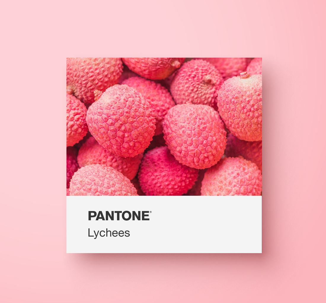
What is Pantone?
The Pantone Color Matching System (PMS) is a standardized color reproduction system that uses a specific set of inks to achieve precise color matches. Each Pantone color is identified by a unique number, ensuring consistency across different print runs and materials. Pantone colors are often used for branding and corporate identity materials where color accuracy is critical.
Impact on Printing
The choice between CMYK and Pantone can significantly impact the quality and cost of your printing project. Here are some considerations:
-
Project Type: For projects requiring precise color matching and brand consistency, such as logos and corporate materials, Pantone is often the preferred choice. For full-color publications and designs with many colors, CMYK is more practical.
-
Budget: If budget is a concern, CMYK printing may be more cost-effective, especially for large print runs. However, for smaller runs where color accuracy is crucial, the investment in Pantone printing may be justified.
-
Printing Method: Offset printing can handle both CMYK and Pantone colors effectively, while digital printing is typically limited to CMYK.
Relationship Between CMYK and Pantone
While CMYK and Pantone serve different purposes, they are not mutually exclusive. Many printing projects use a combination of both systems to achieve the best results. For example, a design might use Pantone colors for the logo and brand elements to ensure consistency, while using CMYK for photographs and other multi-colored elements.
Understanding how to convert between CMYK and Pantone can also be beneficial. Pantone provides color conversion guides that help designers approximate Pantone colors using CMYK inks. However, it's important to note that these conversions are not always perfect, and some color variation may occur.
Conclusion
Choosing between CMYK and Pantone depends on your specific printing needs, budget, and desired outcomes. By understanding the differences and impact of each color model, you can make informed decisions that enhance the quality and effectiveness of your printed materials. Whether you opt for the versatility of CMYK or the precision of Pantone, the key is to align your choice with your project goals and brand requirements.