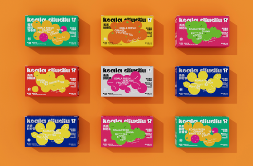
In today’s competitive market, establishing a strong brand identity is essential for business success. One of the most powerful tools in achieving this is color. The colors you choose for your packaging significantly influence how consumers perceive your brand and can create a lasting impression. In this blog, we’ll explore how to create a cohesive brand identity through color in packaging design, including the roles of CMYK and Pantone color printing.
The Importance of Color in Branding
Colors evoke emotions and communicate messages without words. Each color has its own psychological impact, influencing consumer behavior and perceptions. For instance:
-
Red signifies excitement and urgency.
-
Blue conveys trust and reliability.
-
Green suggests health and sustainability.
-
Yellow evokes optimism and cheerfulness.
By understanding the emotions associated with different colors, you can select hues that align with your brand values and target audience.
Establishing Your Brand Color Palette
Creating a cohesive brand identity starts with developing a clear color palette. Here’s how to do it:
1. Define Your Brand Values
Before selecting colors, identify your brand’s core values and mission. Are you focused on sustainability, luxury, or innovation? Your color choices should reflect these values. For example, if sustainability is a key aspect, earthy greens and browns may be suitable for eco-friendly custom packaging.
2. Research Your Target Audience
Understand your target audience’s preferences and the emotions you want to evoke. Conduct surveys or focus groups to gather insights on how different colors resonate with your audience. This can guide your color selection process.
3. Choose Primary and Secondary Colors
Select a few primary colors that will represent your brand consistently across all packaging. Complement these with secondary colors that can be used for accents or variations. This creates a harmonious look while allowing for flexibility in design.
4. Maintain Consistency Across Products
Once you’ve established your color palette, use it consistently across all products and packaging. This includes everything from custom boxes to promotional labels. Consistency reinforces brand recognition and helps consumers associate specific colors with your brand.
Applying Color to Packaging Design
Here are some tips for effectively applying your color palette to packaging design:
1. Use Color Hierarchy
Design your packaging with a clear color hierarchy. Use your primary color for the most important elements, such as the logo or product name. Secondary colors can be used for additional information or design elements. This helps guide the consumer’s eye and emphasizes key messages.
2. Consider the Packaging Materials
The perception of color can vary based on the packaging material. Matte finishes can soften colors, while glossy finishes can make them appear more vibrant. Choose materials that enhance your chosen colors and align with your brand image.
3. Understand CMYK and Pantone Printing
When finalizing your packaging design, consider how your colors will be printed. CMYK (Cyan, Magenta, Yellow, Black) is commonly used for full-color images and allows for a wide range of colors, making it suitable for designs that require gradients and intricate details. However, the final output can differ based on materials and processes, so testing your designs is vital.
Alternatively, if your packaging relies heavily on specific brand colors, using Pantone (spot colors) can ensure exact matches across various printing methods. Brands often choose Pantone colors for their logos and key design elements to maintain brand integrity. At Layout, we understand that every brand has unique needs. That's why we provide both CMYK and Pantone printing options, allowing you to choose the method that best suits your packaging requirements and enhances your brand visibility.
The Role of Color in Brand Recognition
A cohesive color scheme can significantly enhance brand recognition. When consumers consistently see your colors, they begin to associate those hues with your brand identity. Think of iconic brands like Coca-Cola with its red or Tiffany & Co. with its signature blue. These colors are instantly recognizable and evoke strong emotional responses.
Conclusion
Creating a cohesive brand identity through color in packaging is a powerful strategy that can influence consumer perceptions and drive sales. By carefully selecting and applying your color palette, understanding the differences between CMYK and Pantone printing, and ensuring consistency across your designs, you can create packaging that not only stands out on the shelf but also communicates your brand values effectively. At Layout, we specialize in helping businesses develop custom packaging solutions that reflect their unique brand identities. Let’s work together to create packaging that resonates with your audience and strengthen your brand!

